Before + After: Med Mod in Reho
- JCB

- May 18, 2023
- 4 min read
Updated: Feb 24
The story is, this bathroom went on 'vacay to the Mediterranean'. But really she got a facelift.
If you've been following along, you may recall the Rehoboth Beach house makeover we did last year. It was such a fun project because, in the off season, we were actually able to stay at the house as we made it over (dream job!). Just blocks from the beach, this house is the perfect getaway and now, with its fresh new design, it went from meh to mwah! This year, the client was ready for more and wanted us to tackle the primary en-suite bathroom.
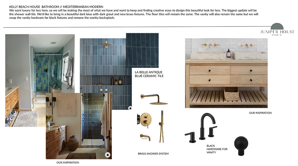
Yes! More beach time and a brilliant challenge; with budget considerations in mind, we needed to update this bathroom completely without totally demolishing it. So first, we had to look at what was wrong. The obvious (to us) was the pastel green and blue glass tile wall in the shower. Some may ask: why is this so wrong? First, it feels very dated, second, the primary colors go against the client's (and my) more modern aesthetic and third, yes, these colors are 'beachy' but not this beach. Rehoboth is not pastel. Mid Atlantic, East Coast beaches are not pastel. Rehoboth is dark blue green water, taupe sand, a mix of pinks from sunrises and moonsets and random shells, pale grays of the boardwalk and driftwood that floats in on occasion. Rehoboth can be clear skies but can also be dark and stormy with the ever changing mood of the weather. This palette was all wrong but it really just needed a few adjustments.
Here's the before:


We had to pinpoint what worked and didn't work.
What didn't work: The shower wall tile and hardware—we envisioned a dark and stormy blue. The chrome fixtures of the vanity were dated. The mirrors were hung too high and they didn't support the beach vibe we were going for. The lighting above the vanity was dated—chrome with Edison bulbs (which are terrible for bathroom lighting btw). The overhead lighting was also chrome and had a cheap nautical vibe that needed changing. We also needed a dimmer (always!) for low key evenings and waking up in the middle of the night to not have a blast of light in sleepy eyes. The tall cabinet looked like a kitchen cabinet and felt very box store and the egregious trim on the top definitely had to go. The wall color was a blueish gray and this, next to the pink and the pastel tiles just felt wrong. There was no story here and we needed to create one. But not all was lost!
What worked: We liked the tumbled stone flooring of the shower and the floor tile throughout the bathroom. It had this subtle shade of pink that is reminiscent of the pink in the shells found in Rehoboth. The bamboo vanity itself was perfectly fine and would work with the new palette that we would create, it just needed some adjustments; the backsplash lip had to go. It wasn't properly mounted to the wall and made it look wonky, so by removing it we will simplify the surface. Adding black hardware will tighten it up and bring it up to date. To create a beautiful contrast with the pink stone and pending dark blue tile, I wanted a washed white wall color that felt like pottery, so Ben Moore's Stoneware with a lime wash glaze on top was the ticket.
Here are my boards which I create before starting every project:


I love creating boards. If it all looks right together on the boards, it will most likely work IRL. It's fun to see it here first and then watch it come to life.
Here's the after!

The story we created was a Mediterranean Modern mix. The rest of the house has a cool Med/Mod vibe, so this is an extension of that. I brought in a vintage rug and painting to give it some soul, the neutral linen and wood bench is a touch of spa luxe, the baskets added texture. There is now balance in this bathroom that feels right not only in this house, but in Rehoboth!

The black hardware and mirror gave the vanity more strength and contrast. The brass lighting fixture softens it a bit. I like that the new palette of the bathroom can be summed up in the vintage painting (and the rug!). It feels very elegant, but very relaxed.

The washed walls feel like a part of the space vs. just being flat white. The new mirror makes the space feel huge!

Yes, it's just a toilet, but now it's an activated space that is pleasant to look at! I sourced the driftwood from my favorite vintage shop in Lewes, Unique Finds and mounted with hanging hardware. I hid the ugly things, like the toilet brush in the tall cabinet.

The new color of the cabinet plus the wall color and beam bring out the stoneware vibe of the floor. The moorish mirror and rustic bowl add to the Mediterranean story.

This shower tile! I can't get enough of it. I also love the dark grout which changes it from just a simple subway tile to something more organic and luxurious. We went with La Belle Antiqued Blue Ceramic Tile by Canvas from Floor & Decor and the grout color was Raven.

I love it when a space considers nature right outside its door, brings in natural elements and makes the most of the architecture. I feel this bathroom does all of that.

Most importantly, the client loves it. What do you think?
Juniper House is a full service interior styling studio helping clients realize their dream space. Contact us if you want us to help create your dream! hello@juniperhouse.studio


Comments